As I wrote earlier today, the 2008 Wellcome Image Awards (formerly the Biomedical Image Awards) have been announced. 22 dazzling, advanced-tech produced, coloured images of tissues, cells and molecular models were put on display in the Wellcome Collection foyer yesterday and have also been laid out on their website for the public eye to admire.
The top of the biomedical image pops? Or what? Am I the only person who is beginning to feel saturated with biomedical images? Not only is this culture as a whole swamped with pictures—on billboards, in newspapers, on websítes and blogs, not to speak of the pictorial explosions on Youtube and Flickr. The professional biomedical media are also rapidly becoming heavily visualized. Every life science journal with self-respect puts eye-popping bio-pictures on its covers; and the articles between the covers are filled with micrographs and visualizations. The popular science media are no exception: amazing picture of dendrites, ribosomes and embryos everywhere.
Fascinating, yes! But also a trifle difficult to keep up with. The more pictures there are to see, the less time and attention each and everyone of them gets. I must admit I feel mildly saturated. Biomedical picture fatigue is beginning to set in.
Youtube, Flickr and hundreds of institutionally based online image collections are what they are, i.e., repositories. But the selection of award winners doesn’t necessarily have to result in yet another repository. So my suggestion for the next year’s Wellcome Image Award is: Be more selective! Allow the jurors to choose one picture only (maybe three at the most). And don’t take the easy solution, by leaving it to the website visitors’ vote.
My sense of fatigue also has to do with the uncritical presentation of the selected images. For sure, this is not just a problem with Wellcome Image Awards. Most awards of this kind (and there are several of them) suffer from the same problem. It is as if the jurors believe that most members of the public are still (in 2008) satisfied with yet another Photoshop-edited and colour-enhanced scanning micrograph of a flowerbed of cancer cells.
Instead of being bombarded with albums of beautiful pics, I would like to see more aesthetic assessment. Instead of just displaying their choice, the jurors should come out of the aesthetic closet and pass some outspoken critical judgement. Give us some arguments pro and contra the chosen image. What makes this select image a good picture?
My image fatigue is not alleviated by the fact that the jury has included some fairly dated pictures for the awards. For example, this image:
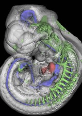
“Wholemount staining of an 11.5 day old mouse embryo showing parts of the nervous system stained green with an antibody to neurofilament, the floorplate and endoderm stained blue with an antibody to HNF3beta and the heart stained red. Unstained tissue appears grey” (James Sharpe, MRC Human Genetics Unit, 2003).
—produced by a technique called optical projection tomography developed at the MRC Human Genetics unit in Cambridge—was cover embryo on Science magazine already six years ago (in the April 19 issue, 2002)!

I would probably become more alert if I weren’t served off with some old and widely spread images. In fact, the well-known model of a prokaryotic ribosome which has been travelling with the University of Sunderland Design4Science exhibition (lots of good pics from the exhibition on Flickr here) is also among this year’s 22 selected award winners. I believe an image contest becomes more exciting if choice falls upon a picture we haven’t seen before!
Biomedical image fatigue
As I wrote earlier today, the 2008 Wellcome Image Awards (formerly the Biomedical Image Awards) have been announced. 22 dazzling, advanced-tech produced, coloured images of tissues, cells and molecular models were put on display in the Wellcome Collection foyer yesterday and have also been laid out on their website for the public eye to admire. The top of the biomedical image pops? Or […]
