The array and variety of visualizations in postgenomics are seemingly unlimited. Here’s a subset of Marc Vidal’s research group’s preliminary map of the human interactome, originally published in Nature, vol. 437, pp. 1173-78 (2005).
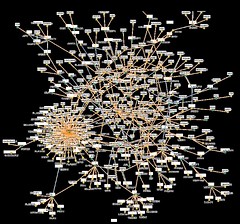
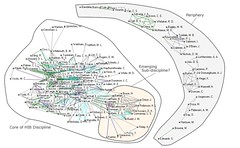
I don’t know why I find this kind of network patterns so alluring. Network pics like these probably help sell grant applications, in this case (says Vidal, “Time for a Human Interactome project?”, The Scientist, vol. 20(3), p. 46, 2006), “an investment of $100 million should be enough to correlate the genome with function, and identify new basic research and drug targets”. The one above reminds me of visualizations of co-citation analysis patterns (which were invented by Henry Small in the 1970s) , like this one:
(from: http://informationr.net/ir/10-2/paper220.html)
Visualization of … II
The array and variety of visualizations in postgenomics are seemingly unlimited. Here’s a subset of Marc Vidal’s research group’s preliminary map of the human interactome, originally published in Nature, vol. 437, pp. 1173-78 (2005). I don’t know why I find this kind of network patterns so alluring. Network pics like these probably help sell grant […]
